For Jasmine Ross & Beauty Plus
This case study was written as an extra response for my spring Photography Project Seminar class taught by Lisa Kereszi.
Intro
A few months ago, Jasmine and I were waiting for camera gear at Isaac's photo equipment desk. She was talking to me about her photo thesis and somehow the topic of websites came up. Like I had been all semester long, I was eager to dive into new design projects and quickly blurted out, "if you need a website or portfolio, I would be down to make it." She seemed excited about the idea and we agreed we would talk further about it as the final weeks of the semester approached.
Throughout our discussions on what the site should look like, one sentence kept coming back; "the website should let the work speak for itself." How do you create a minimalist experience while keeping things elevated and fun? How do you know when to cut back, even though as a designer you want to be experimental? This case study explores the design decisions I made (and didn't) when designing her website, as well as exploring Jasmine's "Beauty Plus" project that was a star element of the senior art exhibit on May 2.
Beauty Plus
Beauty Plus by Jasmine Ross
Beauty Plus by Jasmine Ross
Beauty Plus by Jasmine Ross
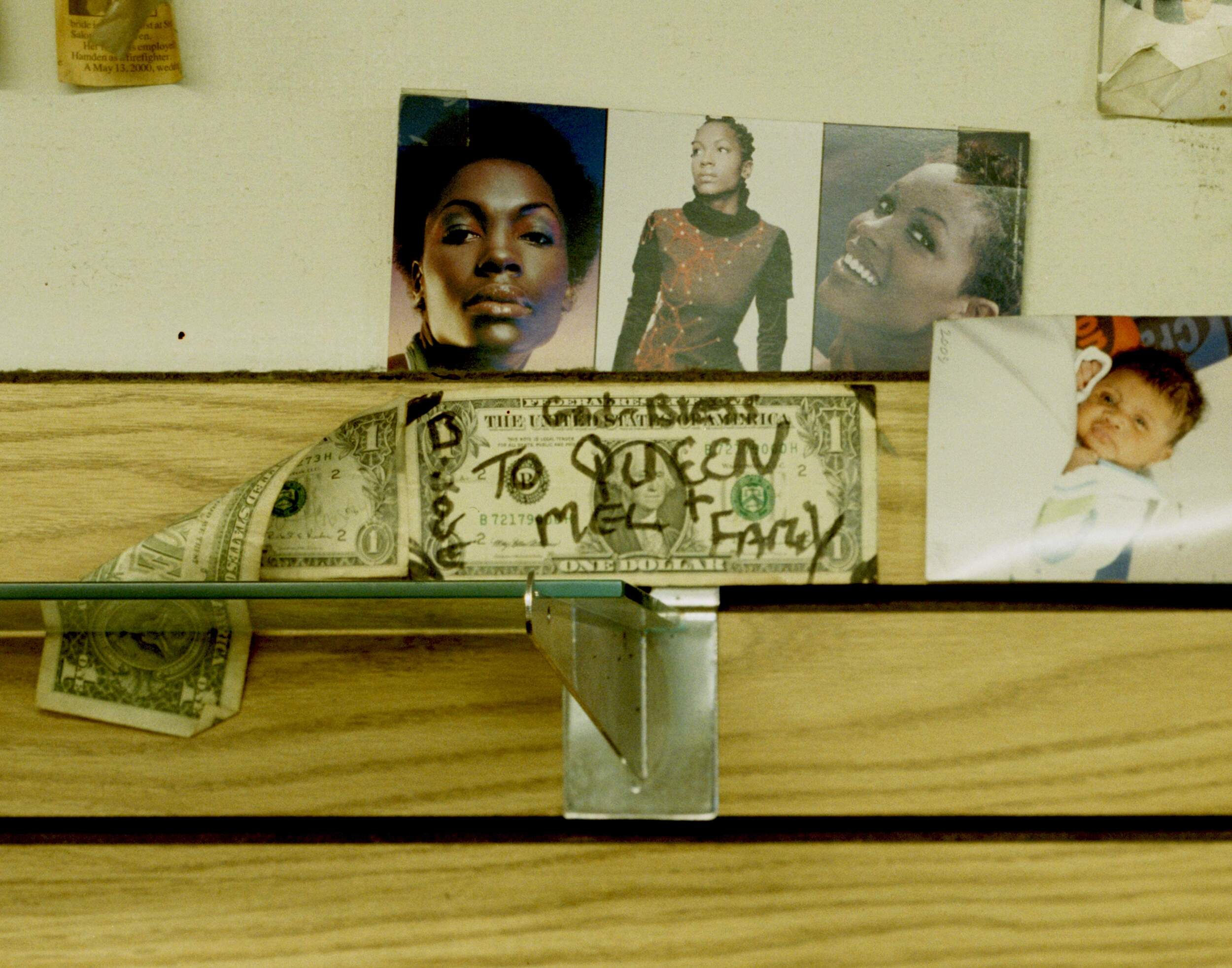
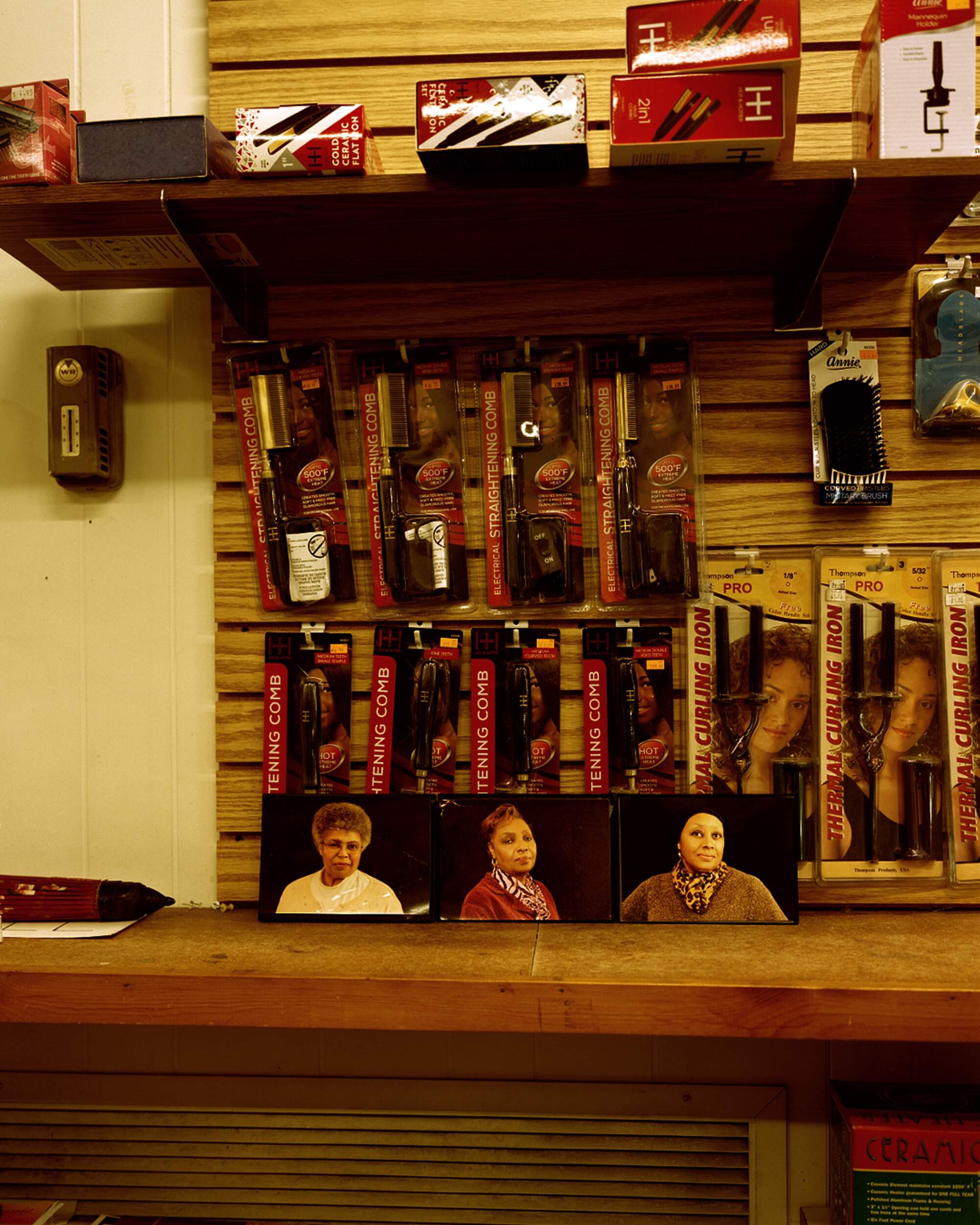
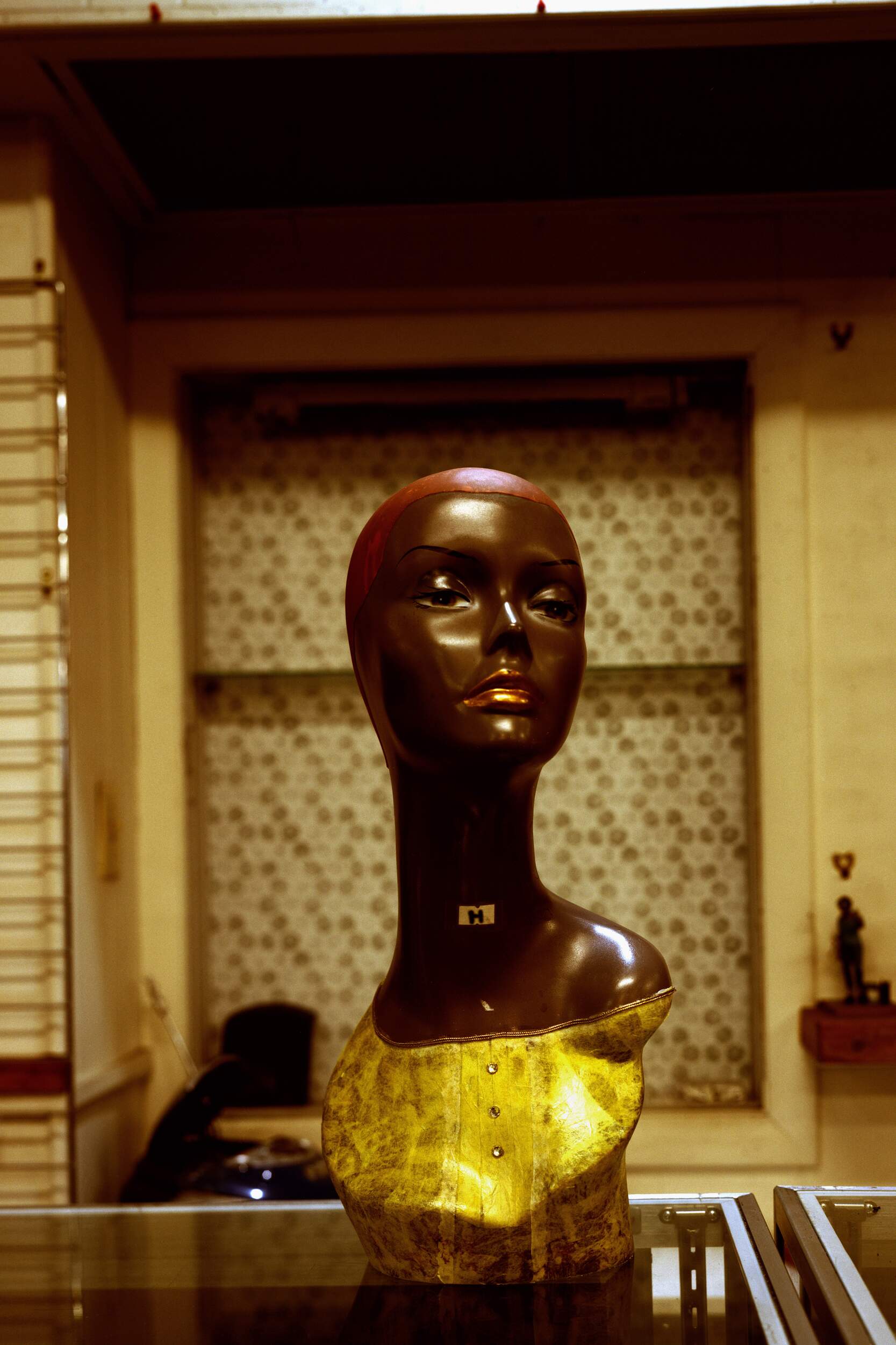
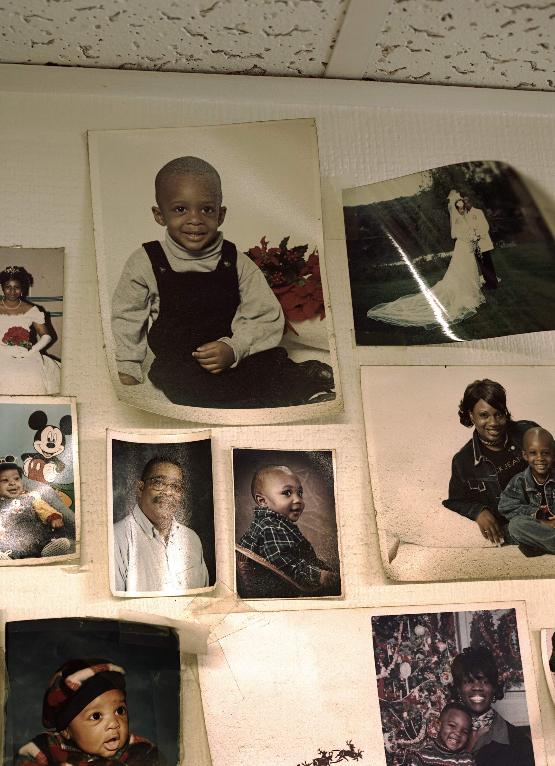
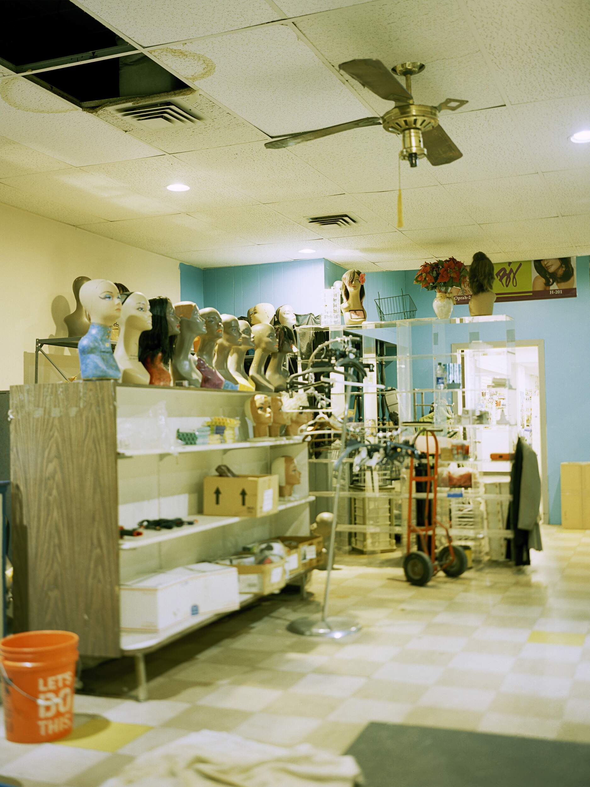
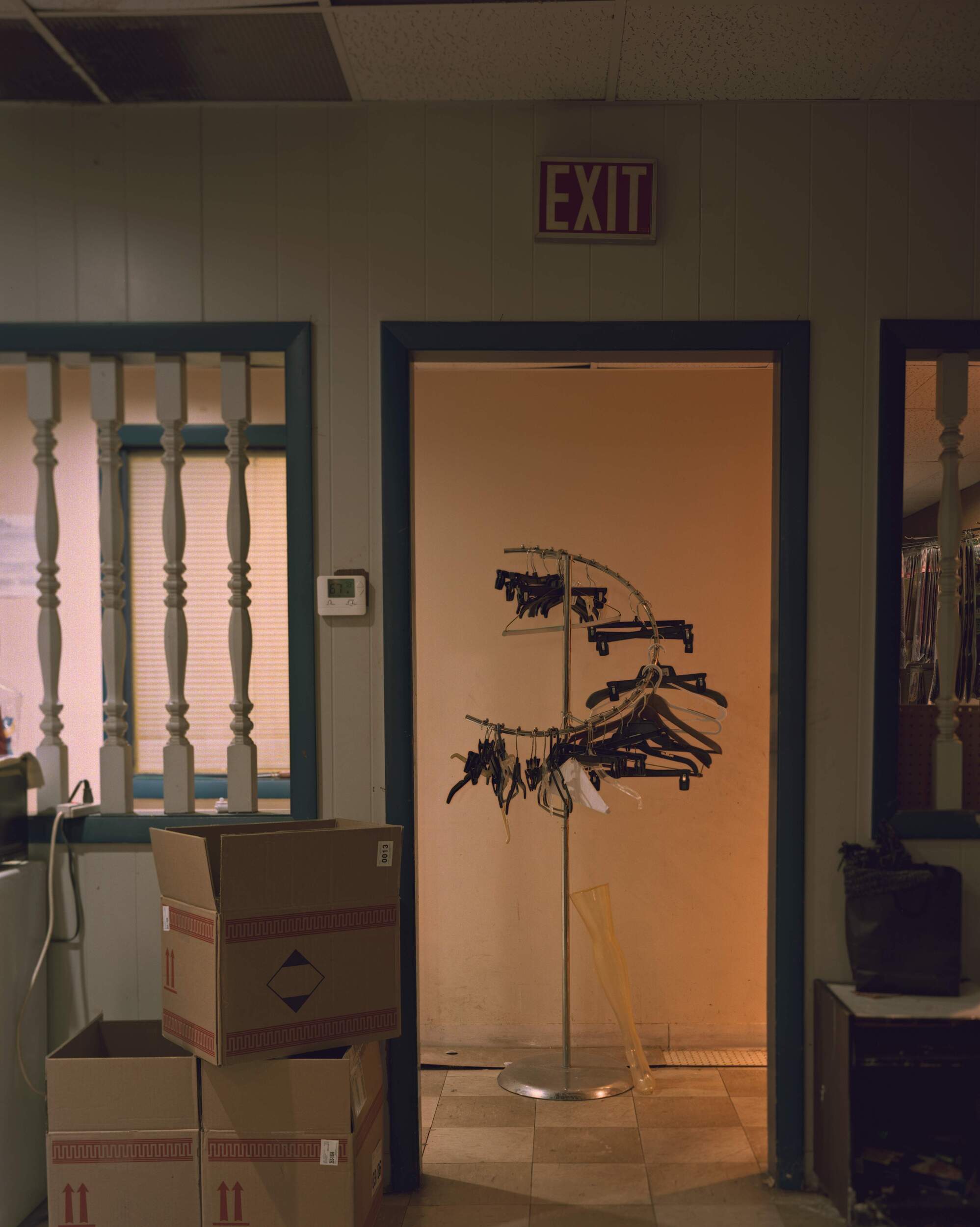
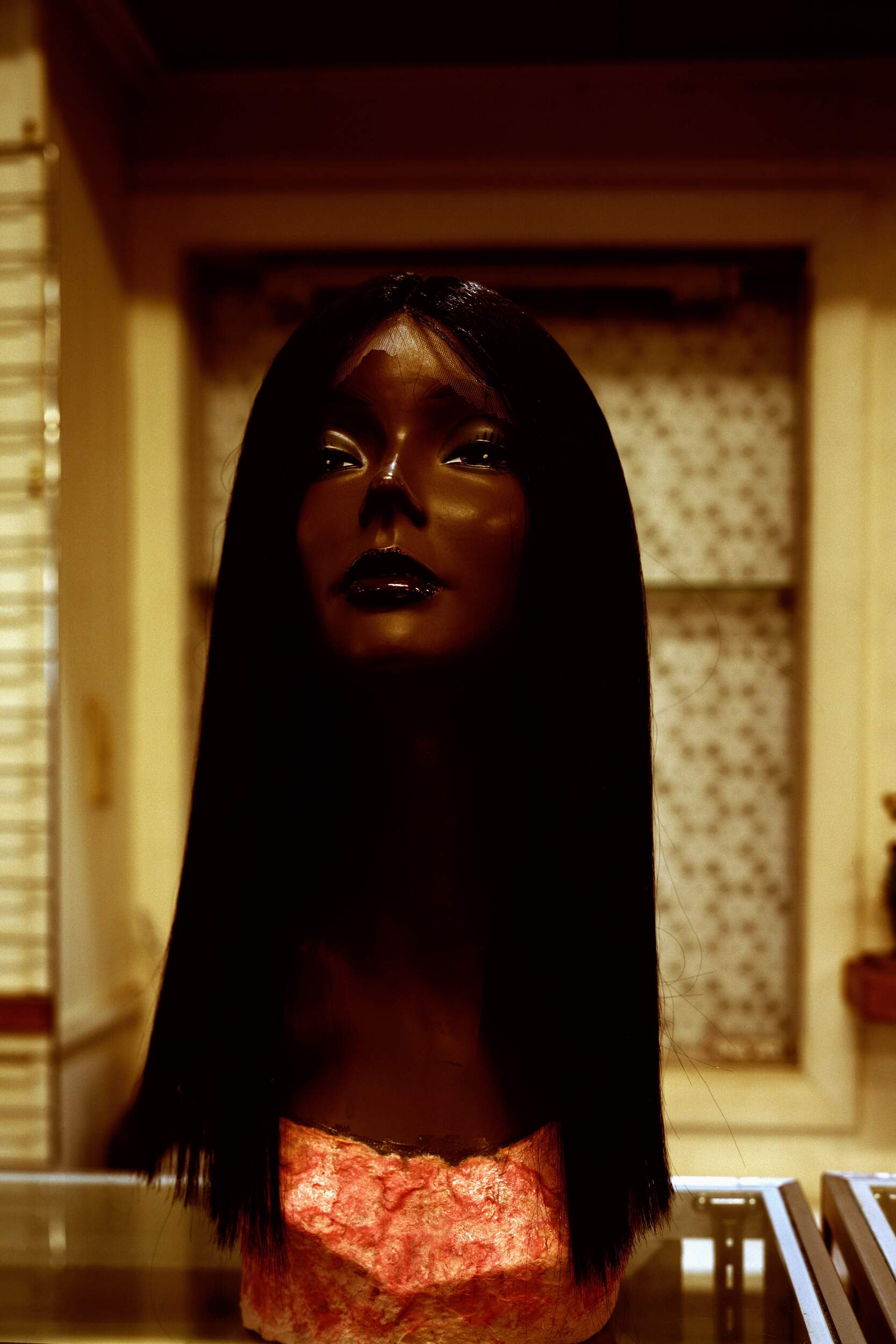
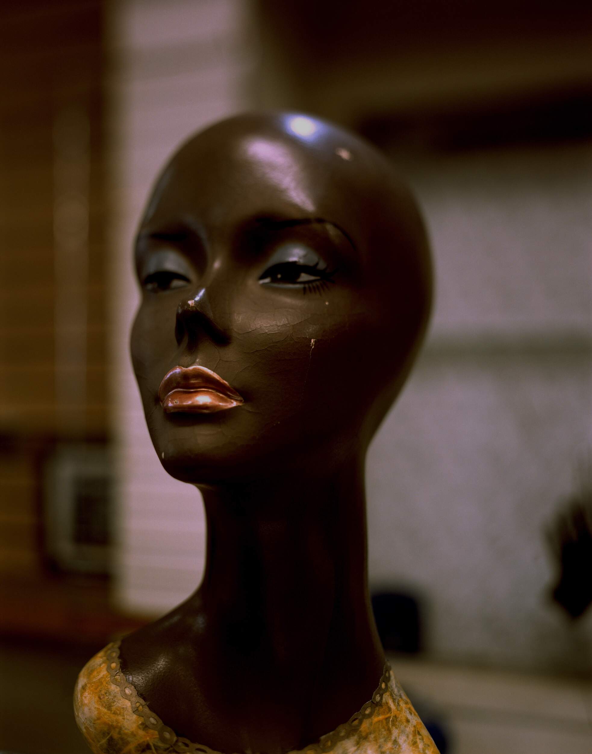
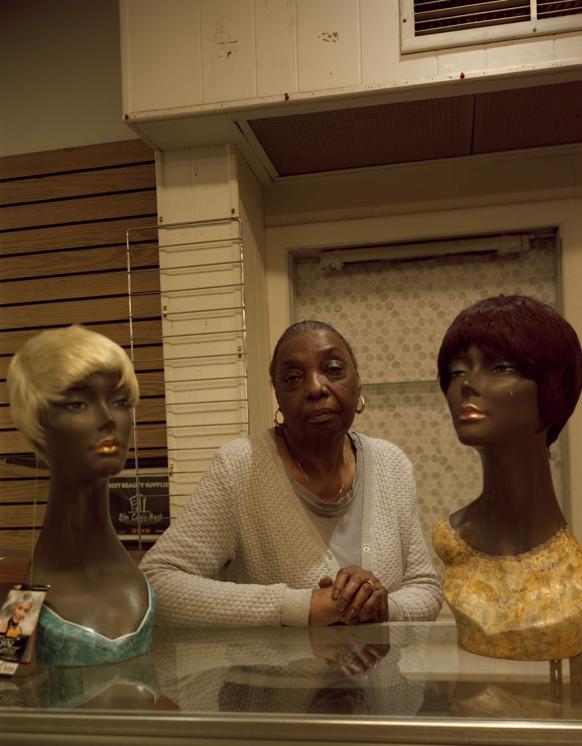
Comprising of 12 photos, Ross's series documents the legacy of a three-generation Black-owned beauty supply store in New Haven.
Beauty Plus by Jasmine Ross

Beauty Plus by Jasmine Ross
Beauty Plus by Jasmine Ross
She is unflinching in her approach and pushes a perhaps undesirable truth to the forefront: this is a store that is slowly deteriorating. Mannequins adorned with store wigs have cracks on their faces, there are yellow stains on the popcorns ceilings, and family portraits once firmly stuck to the walls have begun to peel away (some needing pieces of tape to stay alive).
Beauty Plus by Jasmine Ross
Beauty Plus by Jasmine Ross

Beauty Plus by Jasmine Ross
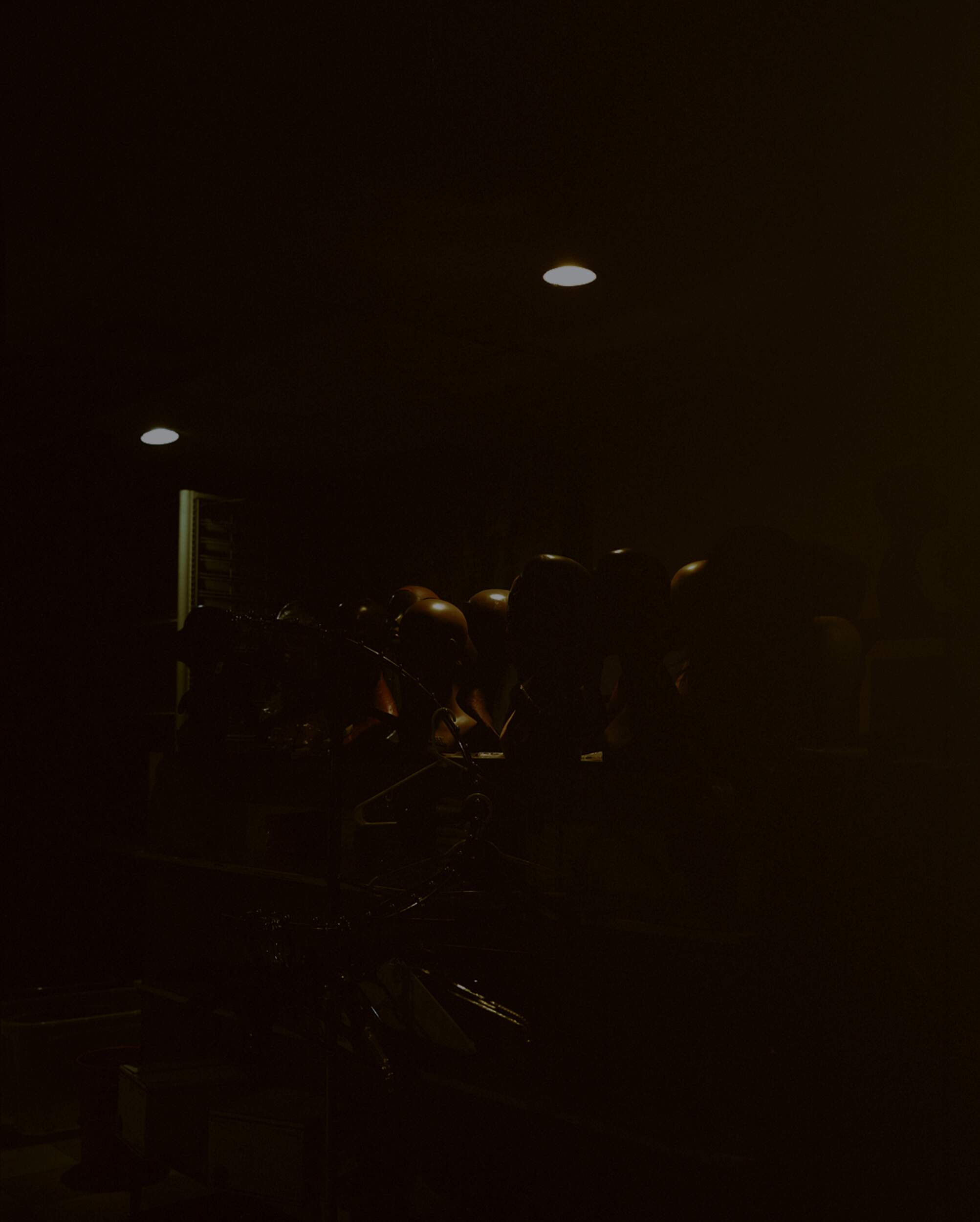
Despite her determination to show that the establishment is – sub-optimally – aging, her compositions show compassion. They tell a story of business owners who erected something from their own hands and who lacked a step-by-step guide from anyone. They had to experience everything themselves for the first time: the highest and the lowest moments. The fourth and fifth image show a subject grow from a young boy into an older man, only emphasizing the stronghold the store has had within that family and their community. Color grading is not cohesive, and lighting goes from extremely minimal to stunningly loud. And yet, each frame belongs and feels part of a larger whole. You end on a striking frame where a series of mannequins sit in darkness, with only small bits illuminated by the faint overhead lighting.
It's eerie, a little sad, but so beautiful. It is a fitting ending to a powerful series.
Beauty Plus by Jasmine Ross
Beauty Plus by Jasmine Ross
Beauty Plus by Jasmine Ross
Dot Com
Sometimes, the simplest websites are the most challenging and the most considered. The site I built for Jasmine is fundamentally uncomplicated and extremely minimalistic. However, to produce an enjoyable and simple web experience, small details need to be made perfect.
Brief
Jasmine wanted a site that would showcase her black & white film work, her color photography, and her writing. The gallery of any collection of images was to be super minimalistic. Only one image would be visible for the user at a time. By clicking left on the image, you would be able to go back: right lets you go forward. Lastly, there needed to be a place for people to learn about her practice and contact her. Nothing else was needed and importantly, nothing else was wanted.
Inspos & explorations
Knowing that the elements of the site were minimal, I intended to add flavor and spice to each one. In the image gallery, I wanted to add some friction with a rubberbanding effect that would occur when a user tried to advance further past the last image or before the first. When this happened, the image would move in the direction slightly before moving back, indicating a sort of resistance. This idea came from Things, an app that has a similar effect any a user tries to minimize the application window past its minimum point. Beyond just being a quirky gesture, it was a distinct attempt to add friction and keep users aware that the sequencing of a series starts at one point and ends at another. Similar to when you go to a crit and have to view images in their designed order to fully understand the sequence, I wanted to have the website encourage that same form of engagement.
Eventually the idea was scrapped. Friction may produce a meaningful and engaging expereince, but this feature was not something that fit into Jasmine's vision for the site. After all, when a website is supposed to be merely a vessel to let photos speak for themselves, you want the interface to feel natural but also neutral. Design choices should be powerful but understated: this was not that.
The stereotypical Yale MFA photo portfolio
Whenever you are designing or building everything, it is important to understand the surrounding context of design. In the case of Jasmine's site, we often brought up the portfolios of current Yale MFA photo students. In all cases, the sites were very minimal, featuring just a collection of photos with their name somewhere on the page. Many don't have artist statements or fancy animations. They are bare bones showcases of their incredible art. This was partly the web tradition Jasmine wanted to participate in with hers. The question then became: how do I make a site that does exist amongst this norm while also producing an elevated experience?
Final features
Hovering italics
When I was working with Jasmine to find what type of typography she wanted for the site, it was clear we wanted something elegant and clean. The main font would need to be a serif that did not have too many quirks or show off too much eccentricity. After finding Adobe's Caslon Pro, I knew that we could work with the simplicity and elevate it. I initially tried forcing a few things that just weren't working and eventually shifted focus to another problem I needed to solve. Jasmine's photojournalism piece, "Aquí, a pesar de las iguanas," was titled in Spanish and also English. When the piece was initially published in the Yale Daily News, the English translation, "Here, despite the iguanas," was displayed right below its Spanish counterpart. How do I present both versions of the title on the very minimal home screen? I quickly realized the best way was to have the English translation appear on hover. To add more taste and flavor to the micro-animation, I decided to use the italicized typeface on hover as well.
By having the movement when the font shifts from regular to italics, it clearly communicates to the user that it is clickable and engage-able text. When I first showed the idea to Jasmine, she admittedly did not fall in love on first sight. However, after we both allowed it to sit for a couple days, it became clear it added a nice layer of personality to the site and further elevated the elegant font, rather than hampering its sleekness.
Animations
In a web animations course I have been learning from for the past month, one of the first key lessons is that you can have suboptimal performance rescued by strongly designed animations that evoke responsiveness. Given that the site has to load many photos at their maximum quality (albeit dramatically reduced by me), I knew it was vital to introduce some animations to give the site some grace and time to have all the photos ready. After all, the worst experience on a website is when a photo on a portfolio is loading in the background and all the user sees is absolutely nothing. By implementing a combination of ease-out (starts fast and ends slow) and ease-in-out (starts slow, goes fast, and then ends slow) animations, I can keep the user captivated for the split second moment it takes for the website to be fully ready. It is by no means flawless – I am still unsure if I like the transition between the landing page and the information screen – but it was a first good test at using animations on the web.
Next steps
The site in its current form is not very sustainable. If Jasmine were to make a new photo series today, I would have to:
receive the photos from her
compress them
decrease the max resolution
upload them
manually make the new photo collection code
save and push the code to my repository
This is not efficient in the long run, so I will be building a dashboard where she can drop files and make her own photo collections that will immediately sync to the website.
Additionally, she wants a form on the website so users who are interested in buying work from her or have other inquiries. Both of these will be interesting challenges on how I can creatively deliver and design features that need to be in style and optimized for performance.